
Dear Sir or Madam,
I’ve been applying for a job a while now with little success and I asked myself what could be different in this application process. If I could put some ideas together for an ideal job board that would provide me more joy and less burden during the application period what would those ideas be?
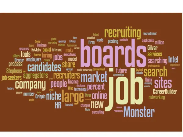
The current job boards seem very static to me with little or no interactivity involved. Also the user experience on some job boards is very poor (!!). The number of people searching and applying for a job is big and it seems that applying for jobs has become an administrative task. No wonder that the applicants stress so much about finding a job. So how should job boards make the searching and applying more enjoyable and interesting for their audience? Here I present some ideas which are applied on other sites and should be applied on job boards.
(Click on the image to open in a new window for a better view)
- A visible distinction between news items and the information.
Not every news is important, and reading something twice if on the first time I wasn’t amused by it for me it’s a waste of time. Especially when searching it will only mislead me from the job offers I want to view. Therefore the unnecessary information should be distinguished from the rest. Job boards do this to some extent, unfortunately by only giving the title another color after you clicked on it.
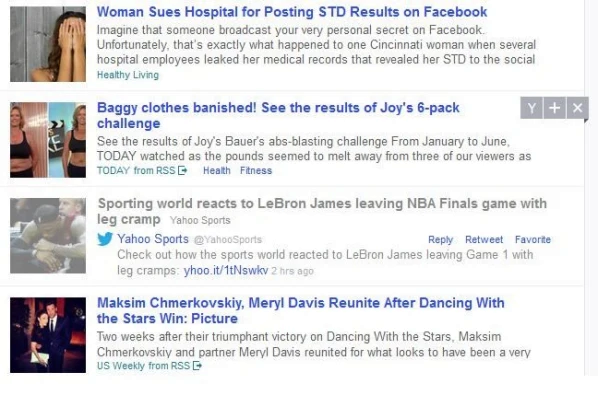
For example: on the front-page of the search engine YAHOO! they apply a low color brightness on the news items which you clicked on or read earlier that day. That makes a clear distinction between what’s new and what’s not so new for me, as to me being the end- user of the platform and the attention- giver to the content.
Video search channel YouTube does the same by giving a the video you’ve watched a low color brightness including the note “already seen”. Great way to distinct so you won’t double up your attention to the same information, unless you want to overview that information again which means the information has caught your attention.
Also unsuitable jobs for me that appear in the list of results should be excluded of the list of results.
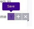
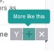
After viewing the vacancy, I should be indicating if the job offer is suitable or unsuitable according to my applied criteria. The unsuitable information should immediately and automatically be kept from the list of results. In this case a checkbox having the options of ‘like/ I don’t know/ unlike’ is an excellent idea! Yahoo does this by using three checkboxes with usable options:
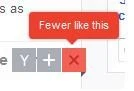
The use of such a checkbox makes the search easier and concrete. At the end of the day I prefer jobs that are a best match to my search criteria and profile.
- Content of newsletters: show more information about what the user is doing and less about how the job board is doing
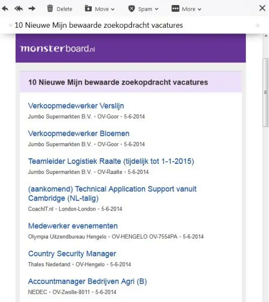
Nowadays the newsletters sent by job boards show which jobs are best suited to my profile. Yet I occasionally receive inadequate (job) offers in my inbox. Not really motivating for me to continue my job search on those job boards, plus a real waste of the communication moment, and that is just too bad. My interest won’t remain stimulated by such content or newsletters. In other words, the content of the newsletter is faaar from my search criteria I indicated previously when I made an account on the job board.
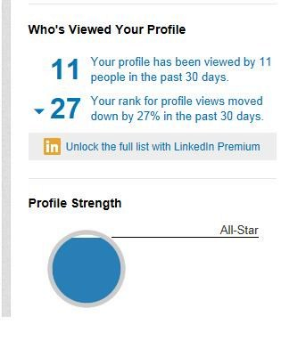
What then?, you may ask. Well, I’m more curious about what kind of application behavior I have. Preferable in a statistics form. For example some statistics about the number of recruiters that have looked at my profile or applications or what are my chances to qualify for certain job titles after I adjust my search criteria and so on.
Adding interesting facts about my application process could be interesting for me because this promotes my job search behavior on the job board. A good example is LinkedIn:
Also the job board could indicate some tips on how I can get more viewers to see my profile and how I could strengthen my profile. More beautifully would be if those tips are related to the branch I’m applying for or the job functions I am applying for. For example, make my marketing skills more visible on twitter by posting a marketing – related heather. Or keep updated with the news about marketing through marketing related sites such as X1. X2. X3, and so on.
- Easy search for offered job fairs
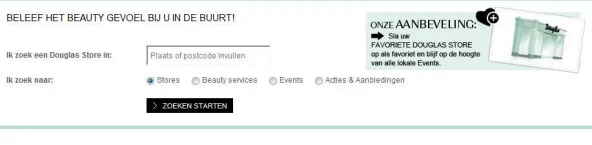
I would like to search easily for events such as a job fair or a course to attend to. The search function on the Douglas Perfumery site with next to it a small note for example a featured event is for me a suitable way to encourage me to visit these events. I could register for the event by clicking on the apply button, because I am already logged on the job board. No new entry forms that would suddenly appear on my screen, how nice!
- A wish list for wishful job functions
Sometimes I see certain job vacancies that I wish I could carry out although I don’t have the years of experience or the profile required for that particular function.
Dreaming about what you wish to get isn’t of no-good. E-commerce sites encourage visitors to set up their wish list because it increases a potential sale. A wish list also reflects the needs of visitors and by placing the product on a wish list this need is actually recognized. So a particular job title in my wishlist will push me to keep working towards that. If calculated what percentage of these titles correspond to each other and which are the demands that mostly come forward in the profile descriptions, would give me an indication.
- Categorize the content
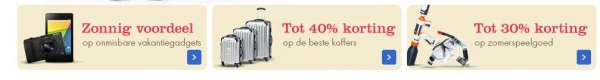
Instead of discounts like in the example it could be about years of experience. For example, entry-level positions, 0-3 years experience 4-6 years of experience, and so on. Even better if I could build my own layout. The presentation is also important. By using some images it will be pleasant for me to make my choice. In other words a useful categorization of the content is ideal the facilitate the making of the choices.
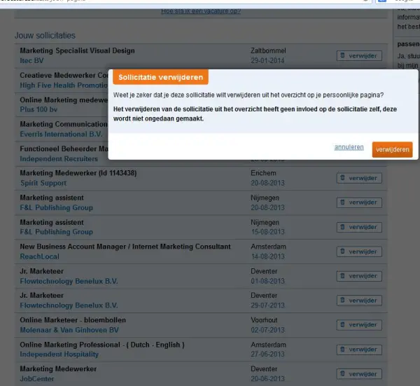
- Ban the administrative tasks!
The list of vacancies I’ve applied for earlier will grow to become a long list. It’s not much fun to delete a single job vacancy at the time. And every time getting the pop-up window with the question if I am sure I want to remove the vacancy from the list, only makes it worse. So instead one could just check all the vacancies he or she wants to remove and remove them by one button.
- The existence of related job functions.
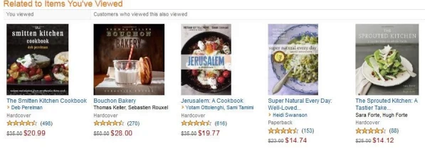
Actually this already exists on some job boards in the form of related job vacancies. I think it’s a good to receive targeted search and more similar jobs. Just that the evaluation of the jobs, as shown in the figure is unnecessary. However, the option to rate the job itself by me is very favorable. For instance, if the function description is well defined.
- A self-evaluation about applying for a job or the job application
Occasionally it is useful to look except on the basis of statistics indicated to my own application behavior. For example I could set up a reflective report. Such a self-reflection would help the candidate with the processing of his or her rejection, instead of keeping those feeling inside.
Or just provide some sort of relaxation on the job board where you can focus all your frustration or adversity. For example a few good jokes to read, or a game where you can throw balls at the recruiters face with balls. After putting all that negative vibe on the side, you could easily continue applying again.
- Playful display of the amount of candidates applying
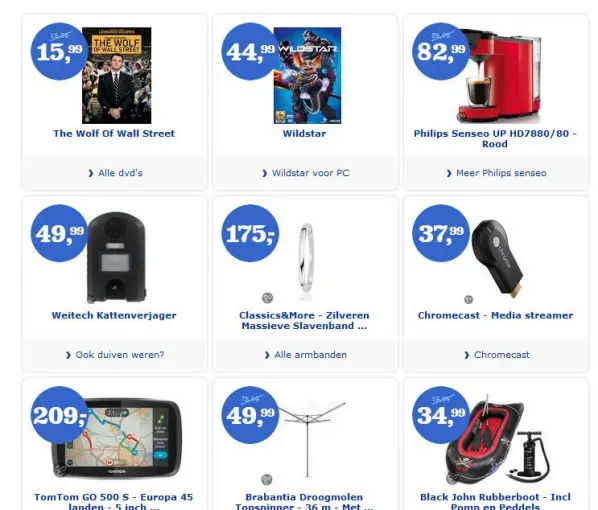
Instead of the price display, as shown in the example on bol.com, it could be an idea to display on the blue dots the number of candidates that have applied for the job. This way I would know exactly where the line is too long! :-D. The number will be systematically updated. Rejected candidates would be removed from the application proces and so the number will descend.
- A reminder: a convenient way to keep up with the actions of applying for jobs
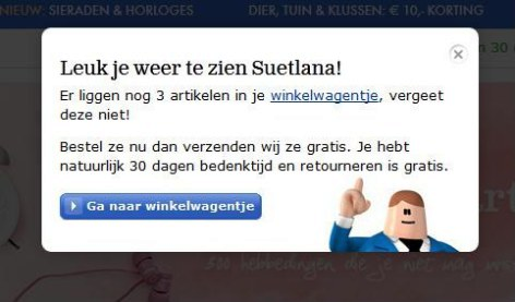
Getting a reminder is a very convenient and great way to remind me that I still have 3 jobs I saved in my profile for which I should send an application right away. Or such reminder is ideal for reminding me that I haven’t applied for a job in two weeks.
- It’s about the user. It’s not about the jobs neither the job boards
So there are lots of great ideas that could be applied to the platform of the job board for a more pleasurable ride on the job board.
First of all, every job board should provide a better user experience. The static look of the job boards is making the search for a new job similar as to doing administrative work.
Like with an E-commerce platform applicants are shopping on a job board platform for jobs to apply to and thus many activities that occur on an e-commerce site include the making of an account, product presentation (in this case, job presentation), orientation, navigation, selections, comparisons, advertising, newsletters, and so on. So why not setting up more interactive experiences in these activities?
Yours sincerely,
Suetlana Wall
Do you agree with the necessary changes in the ways job boards are presenting the job offers? And which ideas would you also add to the list?