Are the customers missing a checkout experience when shopping online
E-commerce is growing rapidly. Unfortunately it is not the same to say about the content of the online shopping bags or baskets that should go through the checkout. Is the user experience failing during the checkout?
The development of e-commerce has taken a robust approach to online customer behavior. The growth of e-commerce is supported by the activities on the interactive online platforms such as Pinterest, Facebook, Twitter, and so on. Not only that. E-commerce is going well through a tight collaboration with other parties that are part of the strategy, and other techniques to influence the online customer behavior help drawing him or her closer to the completion of the purchase.
So, why are the shopping baskets and carts not stuffed and why aren’t costumers regularly coming back for checking out the items they have selected? Why does the shopping on the mobile devices lead to small purchases, and on the desktop it leads to a single major purchase? It might be useful to look at the shopping experience that supposedly should make people buy more or larger items at first. Of course, the game of selling things is not entirely about the shopping basket alone. Eventually the shopping process leads to the checkout of the content of the shopping bag.
Is the website an online shop or does it simply has the added option to shop online?
Many web shops don’t make it clear what’s the site’s purpose iand what exactly is to be expected there. Good arrangement of the information that is relative to the shopping experience is therefor necessary. This means, among other things:
– Make clear to the online customers what they should expect from the web shop. For example, make it clear beforehand for the customers what the intention is of the shopping process. If in a shopping store the customer has an overview of the activities around the shopping experience such as knowing where the counter is, who’s behind the counter, the price tags, the changing policy etcetera, that also counts for the shopping activities around the web shop.
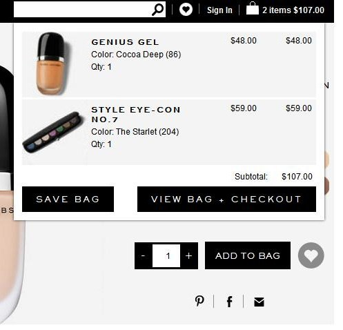
In the example of the web shop of Marc Jacobs Beauty, it doesn’t go unnoticed when the customer has selected some items into her shopping bag/ basket. is shopping and is about to make a purchase. Even the content of the shopping bag remains visible on the screen so long until the customer chooses to click on another item. In this case the items keep staring at you as it is the case when shopping in a retail store. Therefore the intention to purchase feels very real.
The shopping bag is not standing out enough
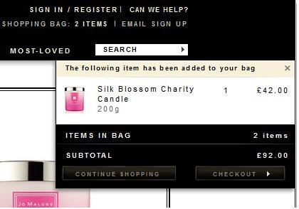
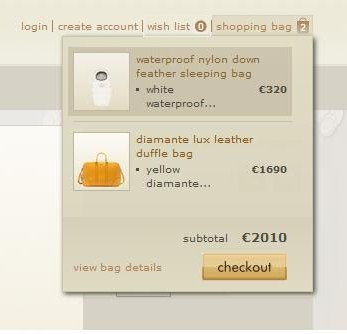
Another issue I find problematic is that the shopping bag or basket is not standing out enough. As a result there could be little interest for the content in the basket. Also the confirmation of the selected items in the bag appears centimeters away from where the basket is situated on the screen, as it is shown in the example below of the web shop of Jo Malone London. The confirmation of the added items in the shopping bag is shown below the search option, which can make the checkout feel further away. Also I miss seeing an overview of what I have previously added into my shopping bag. Looking at the shopping method of GUCCI, all the necessary information, such as login account, wish list and content of the bag, which is related to the checkout is located closely to the shopping bag.
Of course not everything has to do with the web shop itself. As previously stated, following the online customer journey is very important, because some doubts could rise about for example having little sight into the content of the bag during online shopping, or navigating back and forth between the content of the website and the content of the bag, and also the delivery conditions.
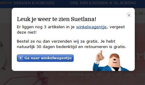
Reminders
The example of the bol.com web shop stays a clear message to the customer communicating that the web shop is happy to see the customer has returned and reminds her that she has a couple of items in her basket and what the benefits are if she continues through the checkout.
Being thankful
Giving away samples, which are free, is exciting for the customers, but make it clear to them that you are grateful for their visit at the online shop for their purchase, even if it is a small one. Instead of samples, suprise them with something in return for their efforts of making a pruchase, because even the visit of the consumer is not self-evident.
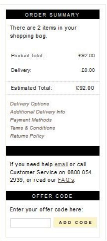
Give a clear summary during the checkout. On the website of Jo Malone London everything relating to the last step of the checkout is arranged together.
Help should always be at close reach. The availability of the help-function doesn’t only give a sense of safety to continue to the checkout, but also lets the customer know that the management behind the web shop has thought about every solution on any troubles the customer might think of before, during or after the checkout.
I want to emphasize that the user experience of many web shops has changed drastically, and that the shopping and more specifically the counter experience could also take a more user friendly and interactive form. Web shops are missing a lot because the user experience could be weakening when it comes to the checkout experience after the shopping experience.